As more people are spending more time in front of screens and on their mobile devices, interest in Dark Mode is increasing. Luckily, it sounds scarier than it is. But it’s still something that marketers need to give some attention to – especially when it comes to email.
Let’s take a look at what Dark Mode is, why we shouldn’t ignore it and how we can make it work to our advantage.
What is “Dark Mode”?
Here’s a simple definition. Dark Mode is a color scheme that uses light-colored text, icons and other graphical elements (like buttons) on a dark background. Think white text on black or light gray letters on a dark blue canvas. Most popular operating systems and apps now allow a user to set their preference to Dark Mode. Some will even automatically detect a user’s preference and adjust the color scheme accordingly.
So why would people want to go to the dark side … er, use Dark Mode?
From a user’s perspective, there are several advantages to viewing webpages and emails in Dark Mode. The light-on-dark scheme minimizes eye strain in low-light situations. Dark Mode reduces screen brightness and can improve battery life for many devices. In some cases, it can even improve content legibility.
Related: 4 CX Trends to Know About
But why is it a big deal for email marketing?
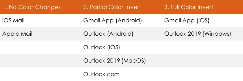
Let’s face it – a lot of work goes into creating good email content (both design and copy). The last thing you want is for the experience to render poorly for your users. Email clients handle Dark Mode differently, usually in one of three ways.
- No color changes. In HTML emails the user interface changes, but there is no impact on how your email renders, with one caveat. Plain-text emails will automatically trigger Dark Mode unless a 2×1 image is added as part of the code to block it.
- Partial color invert. Here, the email client detects areas with light background and inverts them to dark. Dark text also becomes light. Most email clients that use this option allow for Dark Mode targeting. That means that you can override the automatic application of Dark Mode by the email client, but not necessarily the user preferences.
- Full color invert. This inverts the light backgrounds to dark and dark text to light but also inverts light text to dark. Current email clients that support this option don’t allow Dark Mode targeting. That means if someone who uses Gmail App (iOS) or Outlooks 2019 (Windows), for example, will see your email as it renders for Dark Mode.
The table below categorizes some of the more widely used email clients according to the Dark Mode modifications that each accommodates.

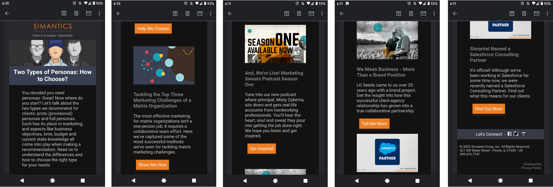
Take a look at these examples of Simantel’s email newsletter and how it renders in the Gmail App for Android with no modifications for Dark Mode. Based on the chart above, this is a partial color invert. Pay close attention to the header logo, article headings, buttons and social icons.

How can I make my email look good in Dark Mode?
Without making any modifications, the emails your customer receives may not be the best reflection of your brand. With a few quick fixes, though, your emails can look great both inside and outside of Dark Mode.
In the email example above, just four tweaks would fix the issues:
- Slightly adjusting the color of the text below the Simantics logo
- Lightening the article headings
- Removing or setting borders on buttons to 1px
- Fixing social icons to use transparent PNGs
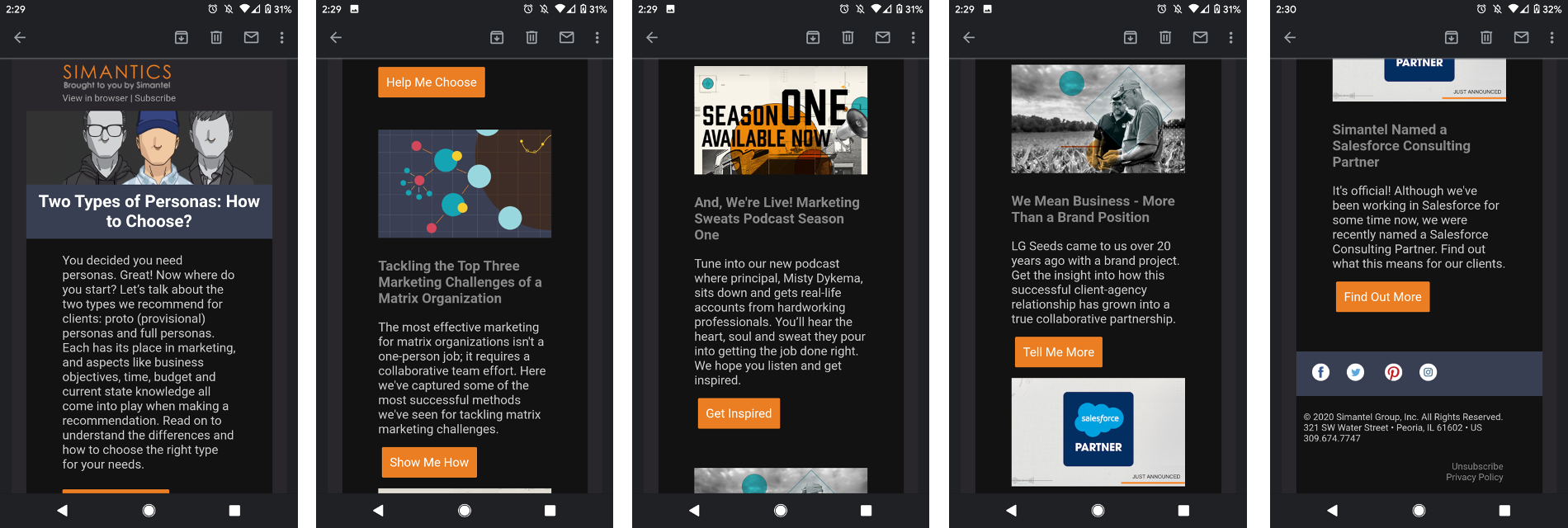
Here’s how the newsletter looks with the adjustments applied:

Easy fixes can go a long way. Need a few more general tips for making all your emails look great in Dark Mode?
- Enable Dark Mode in the HTML. Specify the metadata in <head> and use CSS to support metadata.
- Optimize images for Dark Mode. Ensure that logos with dark areas have a light drop shadow, which will help with visibility when they’re placed on a dark background. Also, use transparent backgrounds for images, logos and icons (like social media) as much as possible.
- Use the prefers-color-scheme CSS media feature to add your own stylesheets for Dark Mode. That way, you can apply your own Dark Mode styles rather than being limited by the email clients’ default color schemes.
As the number of email readers who are proactively selecting the option to view emails in Dark Mode continues to grow, it’s important to understand what we can do to accommodate that preference in a way that benefits everyone.
Still have questions about Dark Mode or need some advice on how to modify your current email campaigns? Don’t hesitate to reach out; we’d love to help.


