At Simantel we like to remain technology agnostic so we can help clients select and implement the best technology solution to meet their needs. We have experts in platforms like Oracle Eloqua, Salesforce Marketing Cloud, Marketing Cloud Account Engagement (formerly known as Pardot), SharpSpring and more.
Just getting started in a new platform can be a little overwhelming. There are so many features available it can be hard to know which ones are most important. Reports sometimes are overlooked until after the planning phase, but they are a key component you’ll want to leverage to gauge how well your campaigns are performing. The insights they provide on your marketing assets can also be helpful for optimizing your current campaigns. But, how do you know which ones to use when you’re just getting started with reporting?
If you’re using Marketing Cloud Account Engagement, these four reports can be a good starting point when figuring out what reporting metrics are most valuable for your goals.
1. Dashboard Prospect Overview
When you first sign into Marketing Cloud Account Engagement, you’re greeted with the main dashboard. This dashboard can give you a quick view of prospects created, conversions, opportunities created and all prospects. Multiple options are available for viewing prospects created across a variety of time frames including today, yesterday, last week, this month, last month, or a customized date range. This helps you see the rate prospects are coming in based on specific dates chosen. How many prospects were created this month vs. the previous month? How many conversions do we currently have vs this time last year? These are some of the questions you can answer, just by looking at the main dashboard displayed when Marketing Cloud Account Engagement is opened.
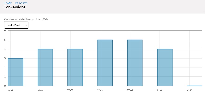
2. Conversions
Your website may be getting a lot of visitors daily, but how many are converting to prospects? The conversion report, found by navigating to Reports > Conversions, breaks down the number of prospects converting daily as well as the name of the prospect and their conversion point. This can help you assess what topics and type of assets those conversion points were related to, giving you an idea of what supporting materials can be created to give your visitors more opportunities to convert.
Related: Two Truths and a Lie: AI in Marketing
3. Lifecycle Report
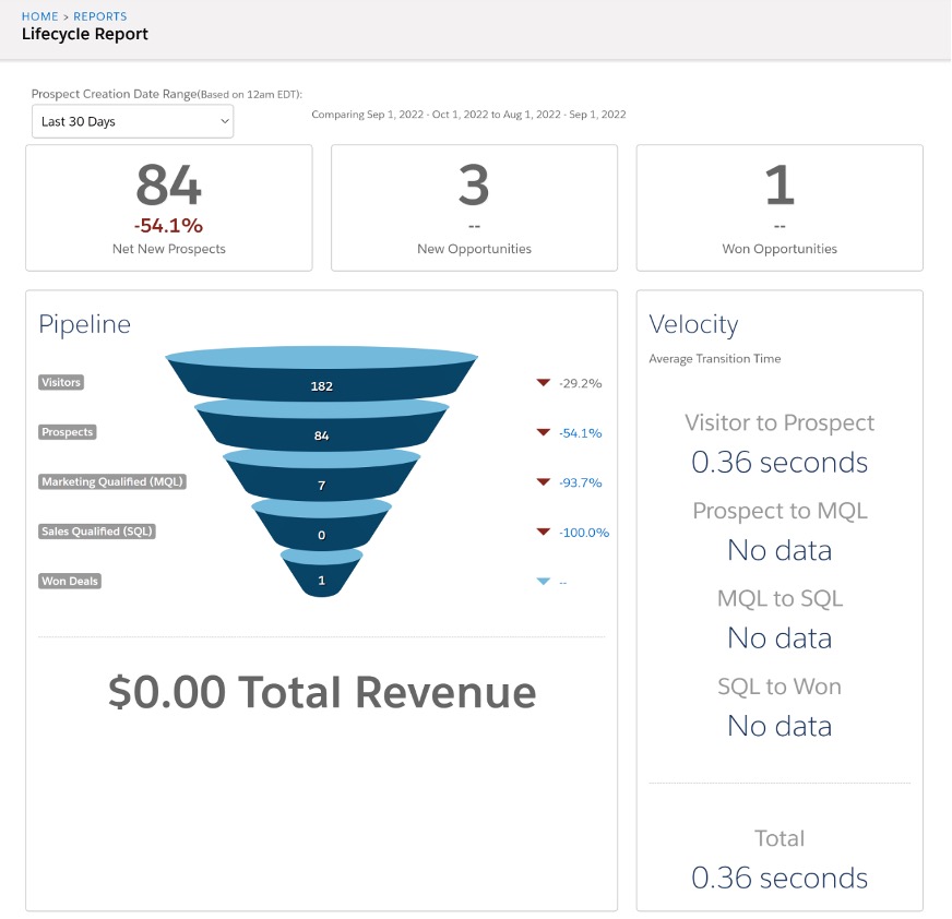
The Lifecycle Report provides an overview of where prospects are in their lifecycle journey within a chosen timeframe and, on average, how long it takes for a visitor to move down the funnel.
Visitors are individuals viewing your content. Once they fill out a form, they become a prospect. A marketing qualified lead (MQL) is created once a prospect has been assigned to a user, and a sales qualified lead (SQL) is generated when an opportunity is created. Prospects move into the last stage, won deal, once a sale has been completed.
The Lifecycle Report will help you understand the conversion rate of visitors to prospects. It also tracks the number of prospects turning into MQLs and how many of those are turning into SQLs. It’s often a numbers game when it comes to providing MQLs for sales, but you need to be able to see the big picture when it comes to how many visitors and prospects are needed to provide the proper amount of MQLs to your sales team to convert to SQLs.
To access the Lifecycle Report, navigate to Reports > Lifecycle Reports. Click on each section (Prospects, MQLs, SQLs, or Won Deals) to see the prospects in that phase.
Related: Get to Know Your “Anonymous” Users
4. List Emails
Emails are an integral part of every marketing strategy, but how do you know your emails are performing well? By utilizing email list reports! Email list reports let you see the good and the bad of how your emails are doing. Depending on what plan you have, you can also see how recipients are interacting with your email and what email clients are being used to view your email.
To see your email list reports, navigate to Reports > Marketing Assets > Emails > List Emails. The main email list shows all the emails you’ve sent. You can customize the data displayed by clicking on the filter icon beside the headings. Click on the email to see a more detailed breakdown of the email report. You’re able to see your email delivery rate, HTML open rate, and click-to-open ratio, as well as the bounces and opt-outs.
The click-through-rate tab helps break down where people are clicking, which can give you insight on your call to action (CTA). What CTA verbiage is doing well? What CTA location received the most clicks? If you have a Plus plan or higher, the Interaction tab can give insight on the read rate, skim rate and forwards. Read rate and skim rate let you know how engaged users are with your content while email forwards can give you an idea of how interesting or relevant topics are to the company receiving your emails.
The Email Client Report tracks what email client your recipients are using to open emails. This can give you a better understanding of how to create content for better viewing across email software.
Related: Bringing Email Dark Mode Into the Light
Benefits of MCAE Reports
These four standard reports can help you get started with taking a deeper dive into your marketing metrics to make data-based decisions for your marketing campaigns. Finding out how many prospects are visiting your website daily, where visitors are converting, what the conversion rate is throughout the lifecycle funnel, and how your emails are doing are just some of the questions that can be answered when using these reports. And don’t forget, explore reports and discuss what success looks like while you are still in the planning stages of your campaigns. Don’t wait until after. Not sure which report to use to track a specific metric you’re interested in? Reach out, we’d love to help.


